Container Query Typography Systems
With the adoption of container queries in all browsers, it's time to use them to fix typography systems.
In every web project I’ve ever done, I always end up creating a set of utility classes for each heading type. Things like h1, h2, and so on.
For example, here’s an excerpt of my old typography styles on this site, written in Tailwind of course:
@utility h1 {
  @apply font-extrabold text-4xl md:text-5xl lg:text-6xl;
}

@utility h2 {
  @apply font-extrabold text-3xl md:text-4xl lg:text-5xl;
}

@utility h3 {
  @apply font-bold text-2xl md:text-3xl lg:text-4xl;
}

/* and so on... */
While this works great for maintaining consistency and adherence to a typography scale, there’s one crucial area where this approach breaks down: the dreaded 2-column. You know the one, where you have an image on one side, and your content on the other:
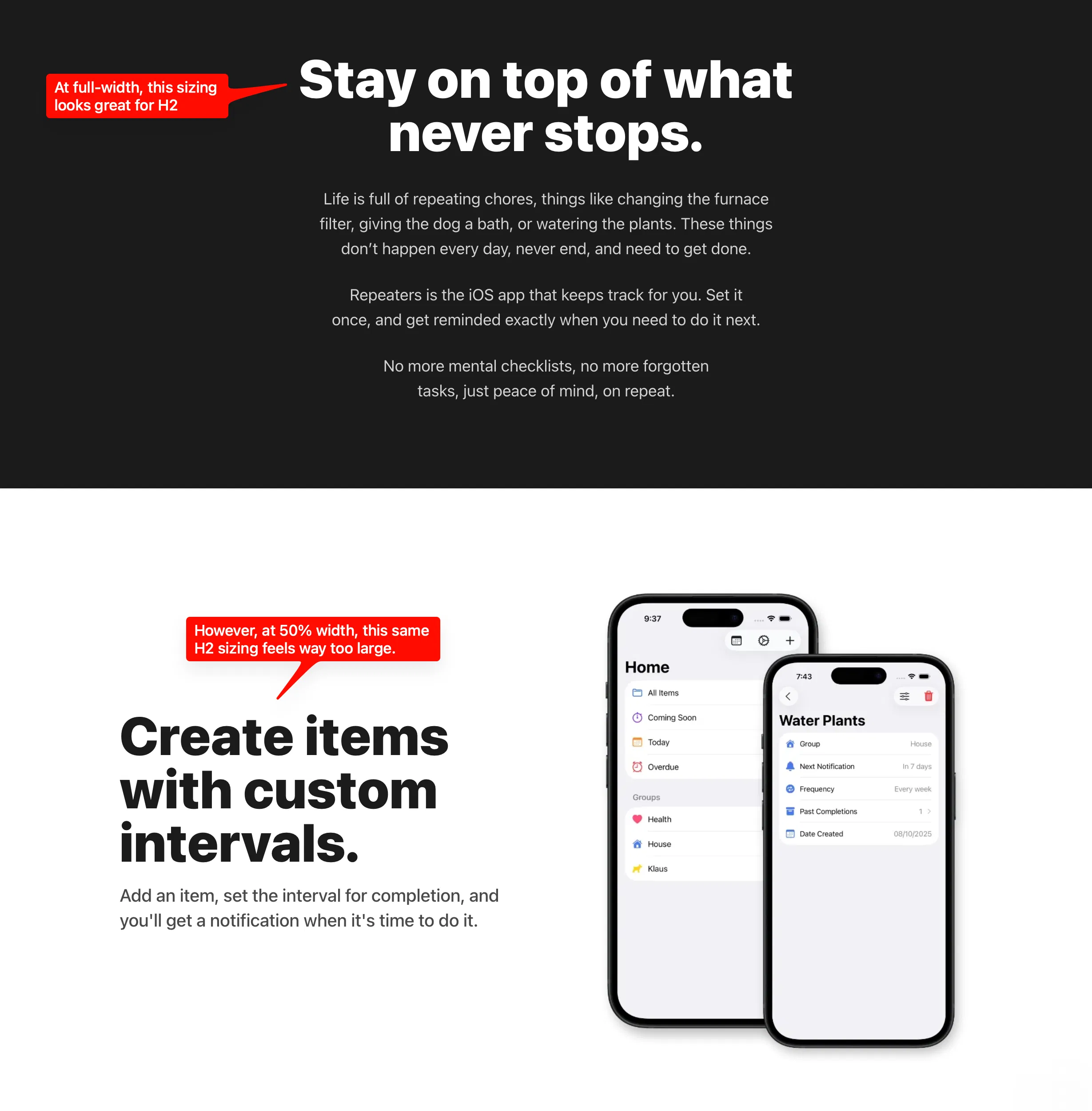
In a UI like this, you may be tempted to use your h2 style, but I can guarantee it will look way large in that context! Now, you may be tempted to utilize the next step down in your type scale, like so:
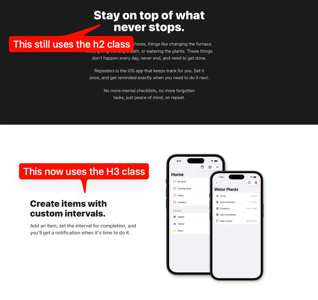
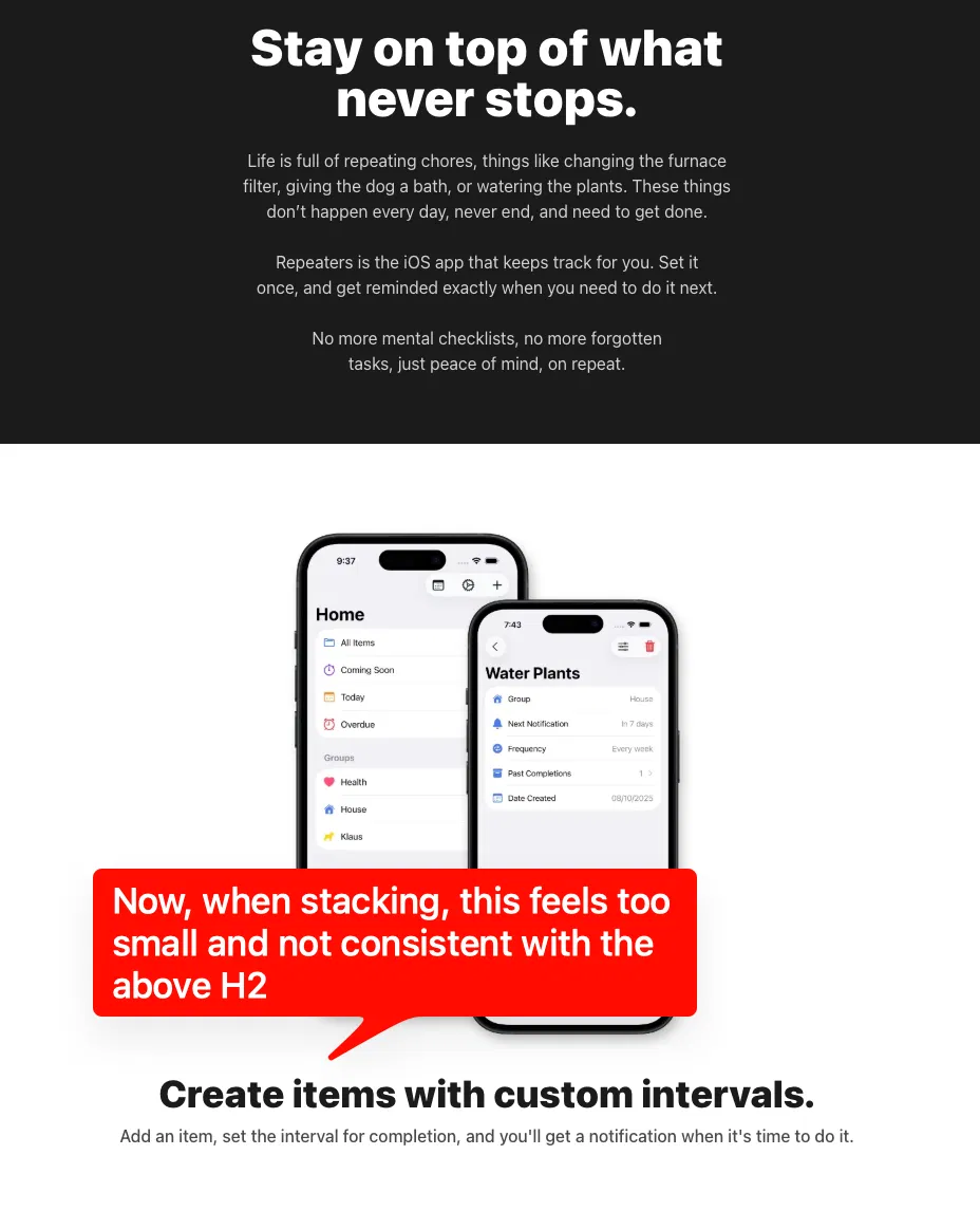
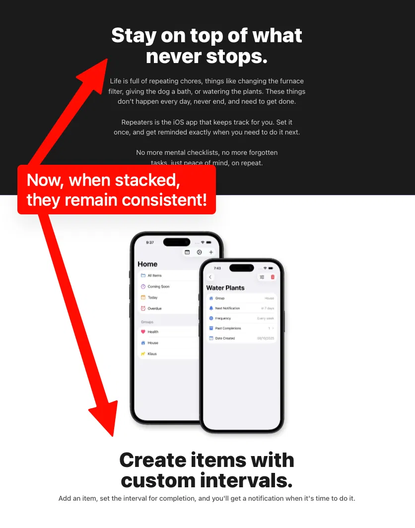
Unfortunately, that introduces another problem. Now, when you inevitably stack on tablet resolutions, your font is too small, and inconsistent with the above block:
With the advent and adoption of container queries and the :has selector, this phenomenon can finally be solved! Instead of utilizing breakpoint-based typography scales, the solution is to use container-based scales! Peep the code:
/* Turn any element with typography into a container */
*:has(.h1),
*:has(.h2),
*:has(.h3),
*:has(.h4),
*:has(.h5),
*:has(.h6) {
  @apply @container;
}

/* Style each class based on container, not viewport size */
@utility h1 {
  @apply font-extrabold text-4xl @md:text-5xl @lg:text-6xl;
}

@utility h2 {
  @apply font-extrabold text-3xl @md:text-4xl @lg:text-5xl;
}

@utility h3 {
  @apply font-bold text-2xl @md:text-3xl @lg:text-4xl;
}

/* And so on... */
Now, your typography styles will respond not to the entire viewport, but their parent container size! So when using the dreaded 2-column UI element, your typography will like you would expect!
Here’s how your exact same h2 class would behave on desktop:
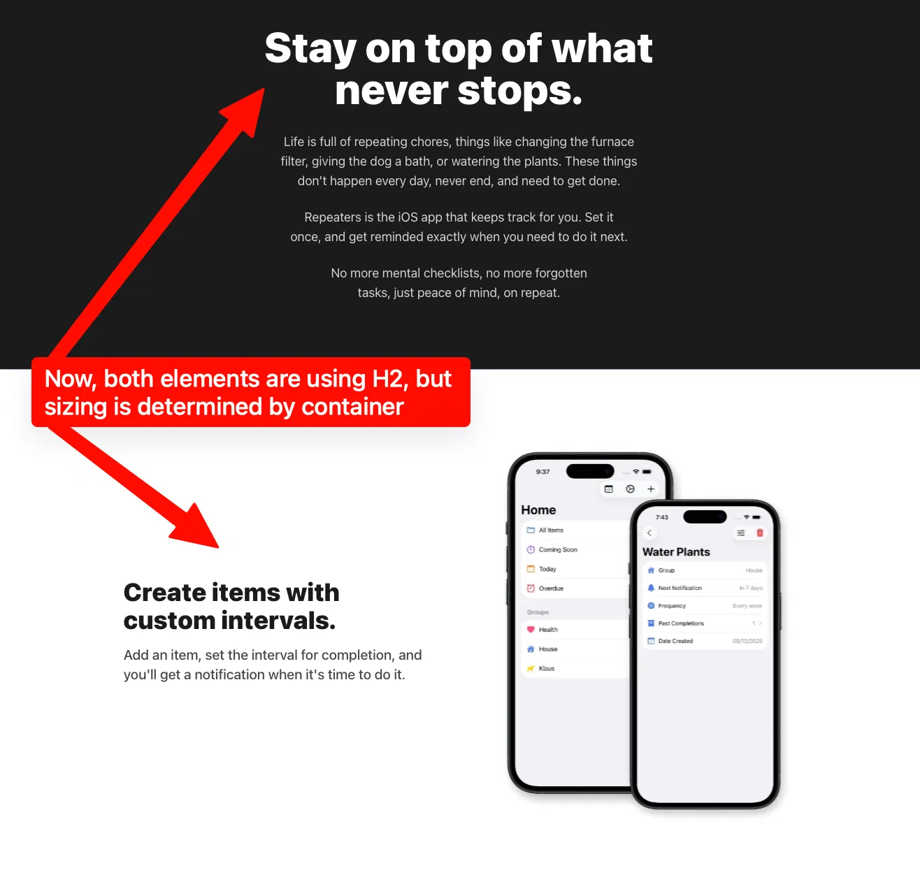
And here’s how it would behave on tablet down to mobile:
Give it a whirl in your next project and let me know how it works out for you!
Did you enjoy this post? Consider subscribing to the RSS feed!